Interactive Infographic
UI/UX, Figma, Prototyping, Wireframing
Objective
The Scope was to convey data points (i.e. Travel History) in a visually unique and stimulating way, while still portraying information in a method that viewers can interpret.
Research and Methods
To gain a better understanding of infographic design principles, literature and media was observed, reviewing examples of the design. Simultaneously, travel data was collected and reflected on how to portray the information obtained.
Interactive Travel Data Dashboard
Challenge: Transform raw travel data into an engaging, exploratory digital experience while maintaining clarity across complex information sets.
My Role: UX/UI & Visual Designer (Independent Project, 2023)
Concepted, illustrated, designed, and prototyped the full experience in Figma.
Approach:
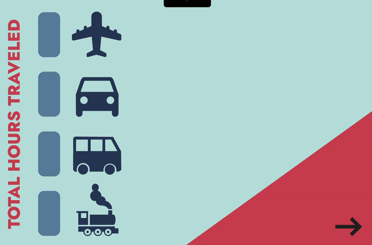
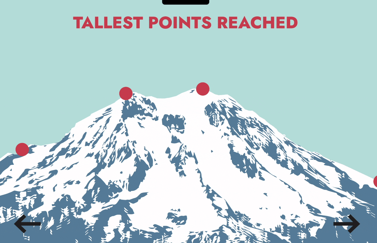
Categorized travel data into measurable metrics (total hours traveled, highest elevation points, destination frequency)
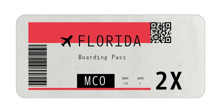
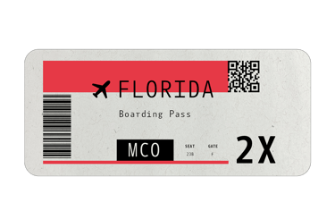
Illustrated custom travel-inspired UI elements (tickets, mountains, transport icons) to create a cohesive visual theme
Built interactive states and navigational flows using reusable Figma components
Results:
Merged quantitative metrics with narrative storytelling
Demonstrated ability to design for both data clarity and experiential engagement
Showcased cross-disciplinary strengths: illustration, systems thinking, and UX interaction
Designed interactive states that guide exploration without overwhelming the user
Enabled users to explore complex travel information in ways that feel intuitive and emotionally reflective.
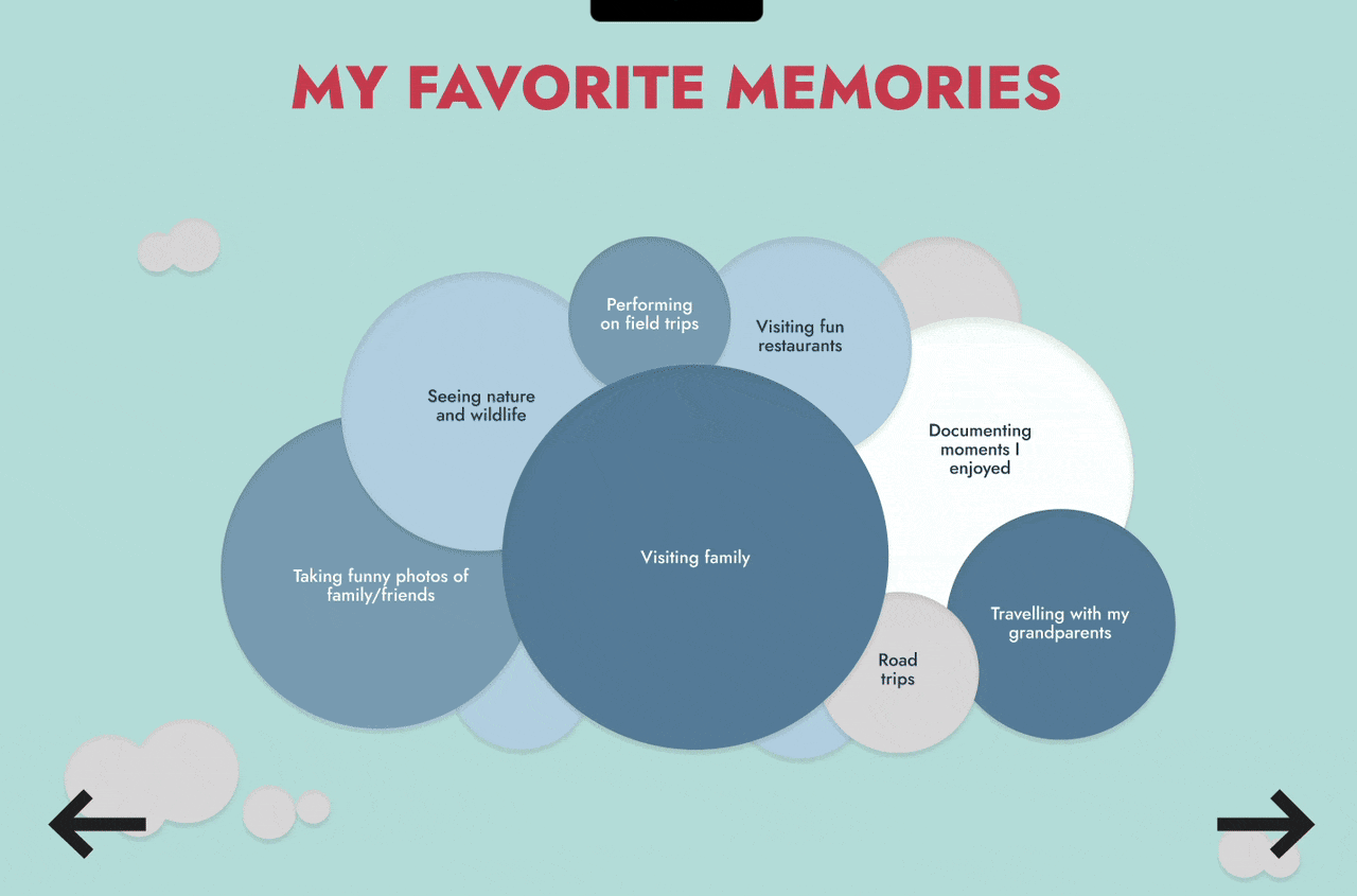
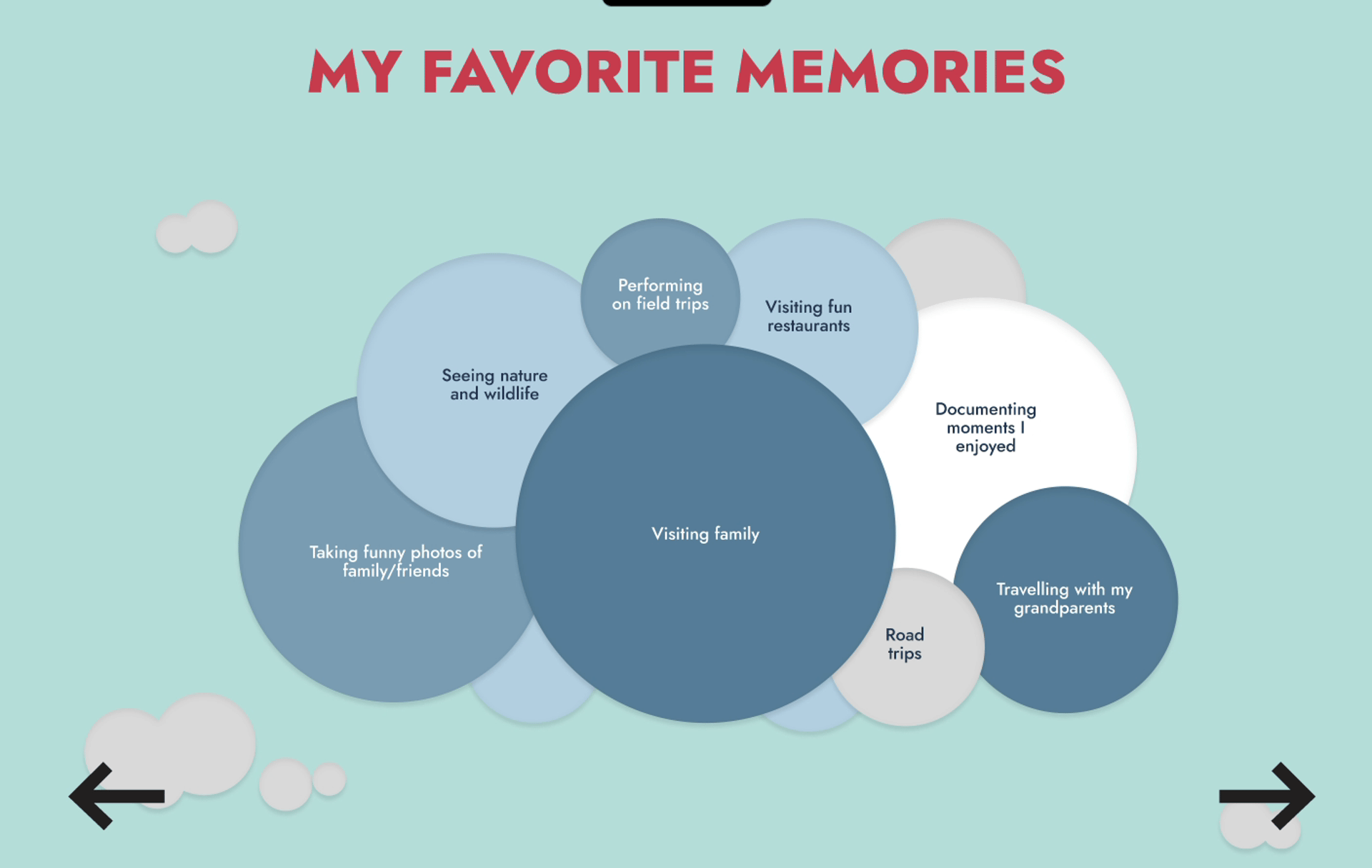
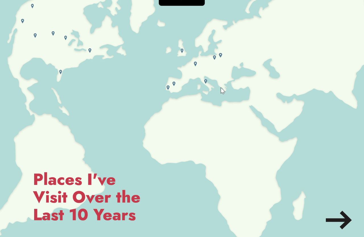
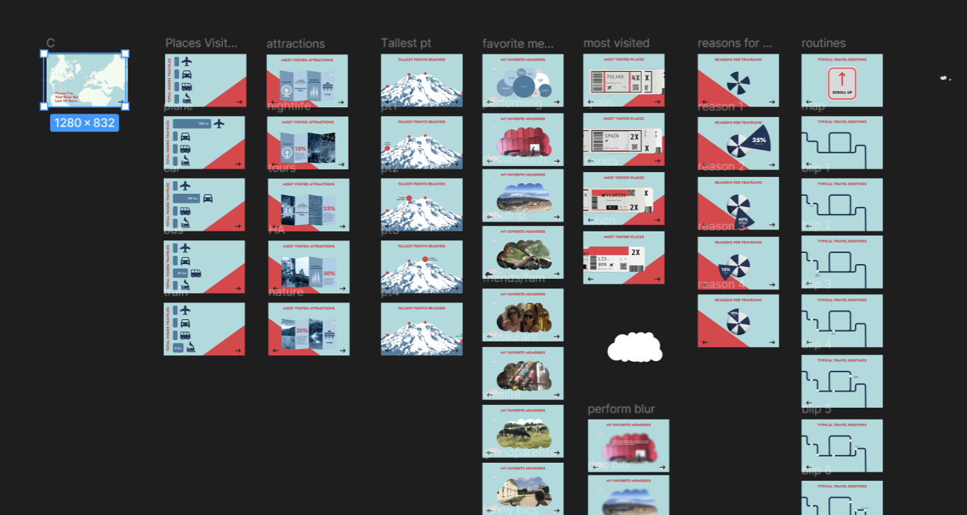
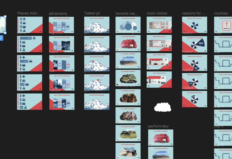
Examples of the interactions in use.
A Dashboard blending data visualization with narrative storytelling through custom illustrations and UX-focused interaction.
Style and Imagery
Elements were illustrated within Adobe Illustrator and used as components for the prototype. In certain cases, when referencing particular places (ie. Louvre), more detail was incorporated for familiarity.
Broader concepts included icon-like imagery.


Illustrated components.
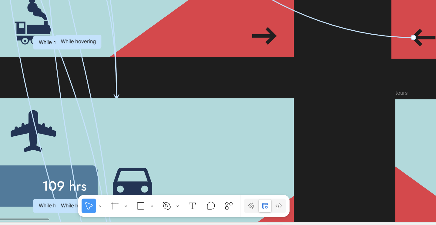

Interactivity & Functionality
Dashboard interactions were tailored to the scene and overall data visualization. Certain scenes are tailored to display information when hovering.
Other scenes allow dragging the scene to reveal information.
Wireframe illustrating navigation flow.
Prototyping
After functionality and flow had been considered via wireframing on Figma, elements were brought from Illustrator and a prototype of the infographic elements was created.
Layout showing interactivity.
Research and Methods
To gain a better understanding of infographic design principles, literature and media was observed, reviewing examples of the design. Simultaneously, travel data was collected and reflected on how to portray the information obtained.

Wireframes and Final Output
Click the video to see a sneak peek of the app.

Using Figma, Wireframes were created to develop a general idea of navigation and flow. From there, the data and design was incorporated.
Contact
contact@karolina-gostomski.com
© 2025. All rights reserved.